
Stock Trading Experience
Web
Mobile
UX Designer
Yang Cong
Content Designers
Astrid Brown
Kate Estabrook
Product Managers
Dan Kim
Aastha Batra
Peter Hwang
Dev Leads
Tony Chiu
Kenny Sanchez

Project Overview
J.P. Morgan’s first online investment platform launched in 2019 and has since served over 1 million users across the U.S.
By 2022, the trading experience included basic functionality but was built on a legacy user interface. To remain competitive in the market, our team initiated a full redesign of the Trade ticket. The refreshed design delivered a significantly improved user experience and enhanced performance across all key metrics.
In this project, I was leading the design for both web and mobile platforms. My cross-platform role ensured a consistent user experience and cohesive visual language. I was also responsible for incorporating ADA compliance and refining edge case scenarios across the product.

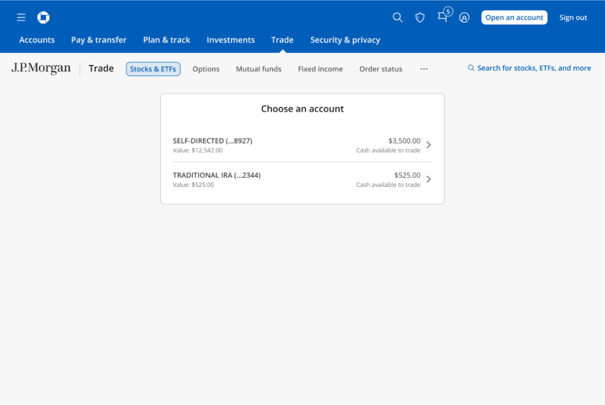
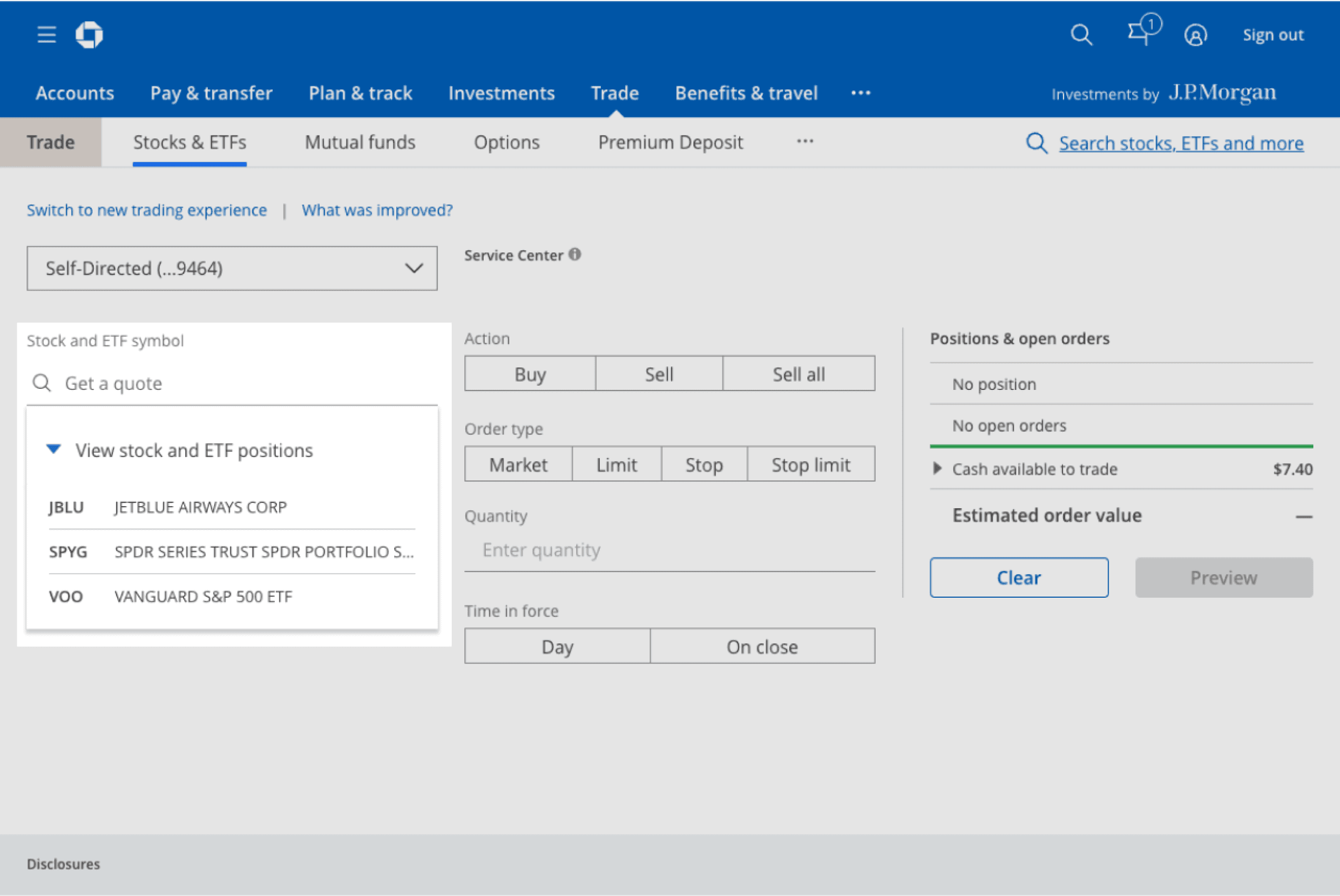
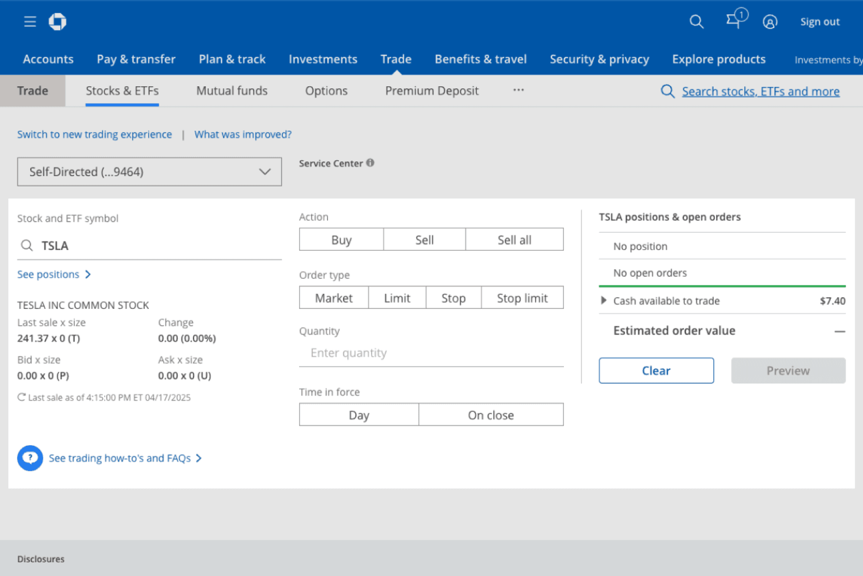
Classic Experience is Bad
No native mobile experience (hybrid only)
Not easy to use
Minimal education and guidance
CX Gaps
Legacy design system
Slow loading times
Low NPS
Competitor Analysis
At the time of our analysis, traditional financial institutions like Fidelity and Schwab — typically catering to more experienced investors—offered robust and comprehensive investment features. However, this often came at the cost of user experience, relying heavily on dense forms and complex interfaces. In contrast, fintech platforms such as Robinhood and Cash App, which tend to serve less experienced users, supported fewer asset types and advanced features but stood out with their clean, intuitive UI and streamlined UX.


Identify CX Opportunities
This journey map can visualize a trade flow and where we can improve it.

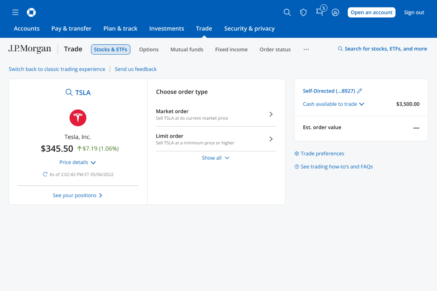
Design Direction
Less Noise & More Guidance
After analyzing competitors and mapping the trade journey, our goal became clear: to create an experience that combines the simplicity and efficiency of fintech platforms with the professionalism and depth expected from a bank. To achieve this, the team opted to build a step-by-step trade ticket that reduces visual clutter and offers enhanced user guidance throughout the process.

Most traders only place market and limit order. Many of them don’t know how a stop order works.

90% orders have Day or Good ’til canceled as time in force. The others are barely used.
Design Exploration
In the discovery phase, we tried different approaches to make the experience. We stress-tested different scenarios while making sure it worked smoothly on different viewports.

User Research
After conducting eight rounds of user research to evaluate various features and user flows, the feedback was overwhelmingly positive. With this strong validation, we finalized the MVP design with high confidence.
It’s very easy to use; I don’t see anything that puzzles me; it’s quite simple.
Round 1, participant 4
Easy and self-explanatory.
Round 3, participant 3
Hell, even something as stupid as that little logo... it matters. It’s so much more pleasing to my eyes. I know that’s dumb but it matters.
Round 7, participant 6
Visual Language Refinement
We updated the UI and data layout to align with Chase’s design system and visual language used across other products. The goal was to create a modern look while maintaining the credibility and feel of a trusted financial institution.


MVP Launch
Tremendous Impact
Improvement in Conversion
over legacy trade experience
19%
Reduction in Completion Time
over legacy trade experience
7%
Retention Rate for over 9 Months
customers who adopted the new trade experience
85%
MVP Launch
Customer Feedback
Although the new experience performed better in data, some users complaint about it feeling like more steps rather than less, because of the step-by-step guidance.
New experience is better
48%
About the same
14%
New experience is worse
36%
Never used classic experience
9%
Positive Feedback
“Easy to use”
This is so much simpler. I buy the same ETFs all the time, so to just have them ready is so much easier. Thank you fo your work on this!
Voice of Customers, Sep 3, 2023
User friendly, easily, and finally you can return easily to new trades. Before I couldn’t directly and it was very frustrating.
Voice of Customers, Sep 2, 2023
Negative Feedback
“Too many steps”
If clicked the wrong button accidentally, there is no way to go one step back. Need to start over. Not user friendly at all.
Voice of Customers, Aug 9, 2023
You INCREASED the number of steps it takes to place an order, not DECREASED.
Voice of Customers, Aug 18, 2023
A/B Test
Guided experience vs. blank ticket
Despite the fewer clicks, user felt like the guided experience added more steps. This made us realize we went too far with providing guidance. To verify our assumption, we launched an A/B test to assess two different trade entry approaches.

A
Step-by-step Guided Experience

B
Single Page with Guidance in Drop-down
From early March to mid April 2024, we collected feedback from over 6,000 clients - half using A and the other half using B. Ver. B wins the competition with a stronger performance and no negative feedback.
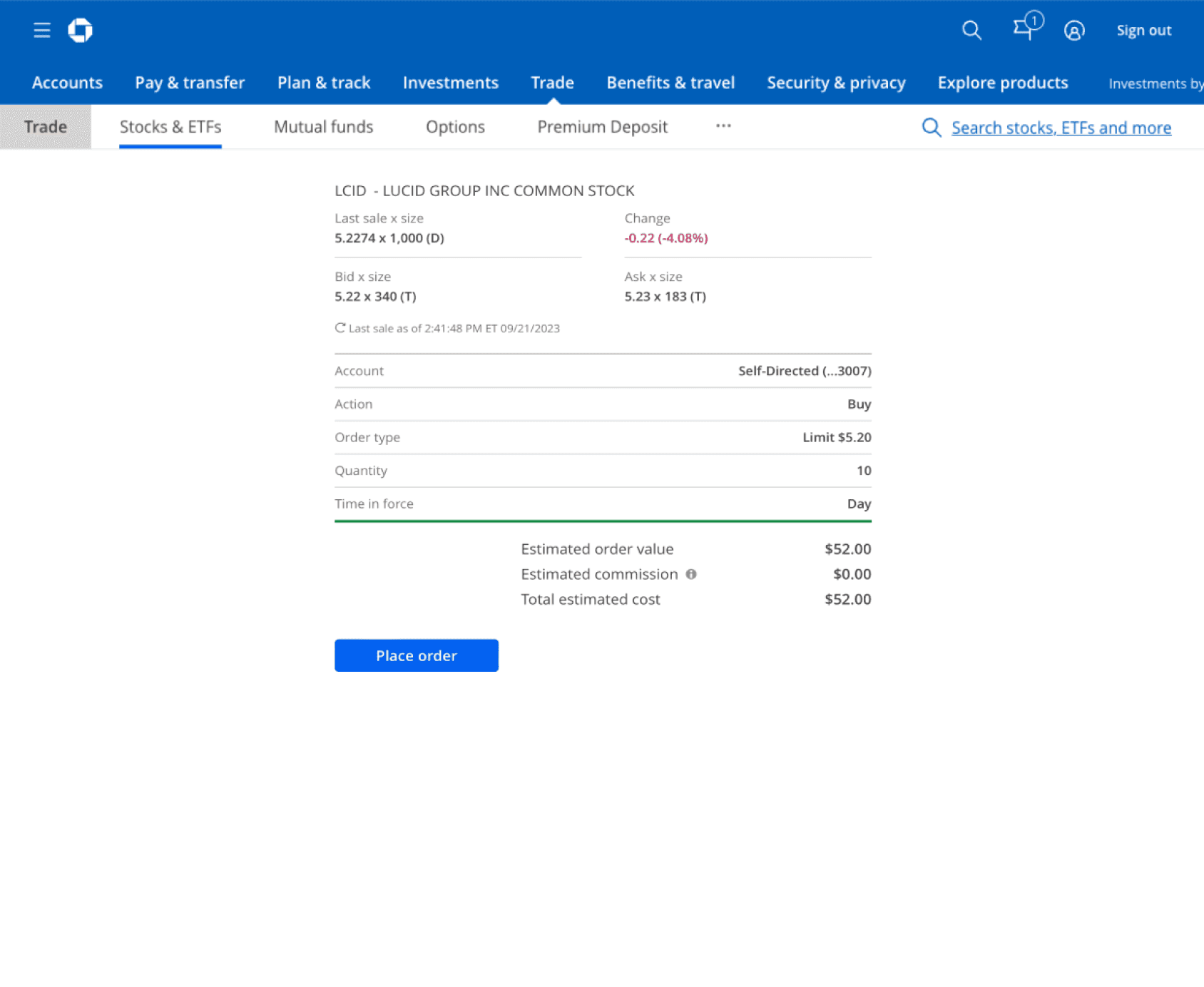
As a result, we replaced the step-by-step design with a single page ticket that still has essential guidance when users need it.
Improvement in Conversion
B 59% over A 52%
12%
Improvement in Avg. Time Spent
B is 12 seconds faster to place a trade
19%
Overall Success
As of August 2024, the redesign has been released to all customers, making great improvements in conversion and completion time.
Improvement in Conversion
over legacy trade experience
130%
Reduction in Completion Time
over legacy trade experience
21%
Reduction in Average Clicks
over legacy trade experience
Microinteractions


Accessibility
As a bank, we need to make our digital experience fully accessible to all clients. With thoroughly defined ADA guidelines, our entire online investment experience meets the WCAG AA standard and is has a great audible experience for screenreader users.


Post-MVP Features & Enhancements
The redesign project marked a huge success, but we didn’t stop there. Over the past 2 years, I’ve led several trade features & enhancements including trade preferences, tax lots, mutual funds, and options to make the trade experience even more powerful.

Trade Preferences

Tax Lots

Options


