
Option Trading Experience
Web
Mobile
UX Designer
Yang Cong
Content Designer
Kate Estabrook
UX Researcher
Vinoad Nair Das
Product Managers
Dan Kim
Rajshree Routray
Eason Feng
Rebecca Peyser
Dev Leads
Tony Chiu
Kenny Sanchez

Project Overview
Following the successful launch of the Stock and ETF trading experience [See case study], our team began extending the redesign to other asset classes, including Mutual Funds, Fixed Income, and Options. Among these, Options posed the greatest complexity in terms of logic and also represented a significant portion of our revenue. Having set a high bar with the streamlined Stock and ETF experience, the challenge was to deliver an equally intuitive Options experience while maintaining consistency with the established design patterns.
For this project, I led the web design for the Options trading experience and also contributed to the mobile implementation.

Classic Experience Analysis
Just like the classic Stocks & ETFs experience, the classic options ticket is hard to use. It has the legacy design system, minimal education and guidance. There is no native mobile experience. We didn’t only look at the UI, but also the statistics of it.
The analysis helped us understand half of the users trade options on mobile and they spent way more time making options trading decisons compared to stocks & ETFs and mutual funds.
Classic Experience Statistics

User Interview
Before starting the design process, we interviewed 15 options traders to ask why, where and how they traded options. Here are highlights from the interview
Competitive Analysis
We looked at the options trading experience across the most popular investment apps, including banks, institutions, and Fintech. The insights we got from these competitors helped us shape our first round design prototype.


Design & Research Round 1
Concerns with Guided Approach
Initially, we wanted to add guidance and modern UI to the options experience, following the pattern from Stocks & ETFs, but soon we realized the extreme guidance wasn’t always the right. We had to replace the guided experience with the single page approach. Many users preferred having simple and up-front information, especially those with higher balances.
Even though the guided prototype tested beat the classic experience in research, many participants express the preference over “more controls” on the screens. In the next round, we decided to compare the guided experience with a more all-in-one approach.
We had to replace the guided stock & ETF experience with an all-in-one approach

A
The guided approach felt like more steps despite the fewer clicks.

B
The single page experience won the competition because it provided everything a user needed at a glance.
Design & Research Round 1
Feedback for Classic Experience
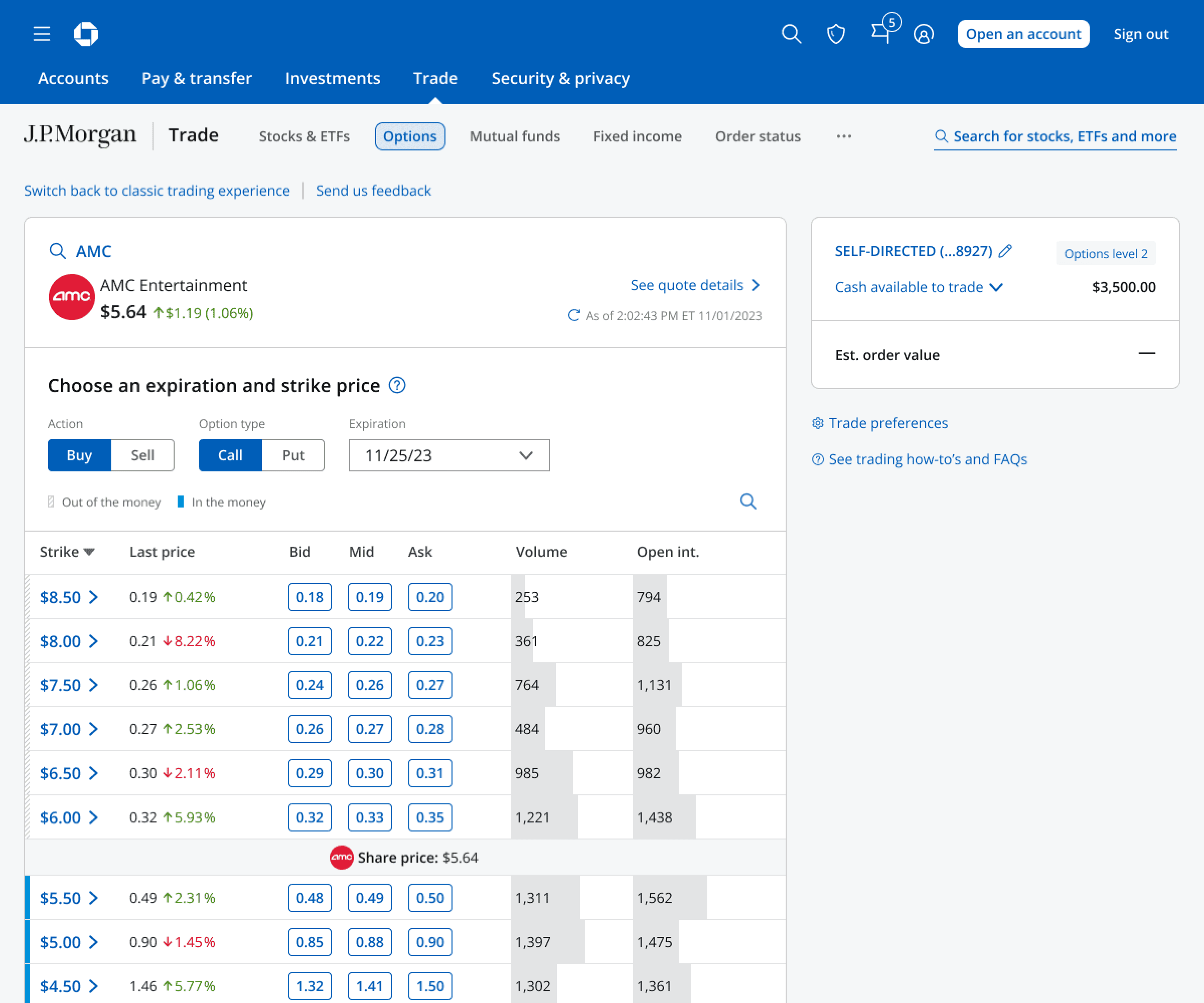
Participants were used to entering trade details in a long form but many of them preferred using the option chain to pick their contract and thought it was easier to use compared to the long form path.


It’s a whole lot of numbers, man... In comparison to something like Robinhood, it’s way more chaotic
Participant 7
I prefer the other way (option chain) where you see all the contracts and how much they cost... that’s how I started buying options, that’s how I prefer it still... I just don’t have enough confidence in myself as a trader to do it like that (long form).
Participant 1
I think I went that route (long form) because that’s what I’m used to on Vanguard. But that option chain route is actually quicker. I can go in with 2-3 clicks.
Participant 6
I wish I knew to click view option chain right away.
Participant 2
Design & Research Round 1
Feedback for Proposed Guided Experience
Regardless of web or mobile, most participants preferred the guided chain that was visually expanded also described as the “non-compressed” version.
Participants also liked the buy/sell and call/put toggle on the expanded option chain which let them adjust their view without going back to the previous steps.

A
Compressed

B
Non-compressed
[B] much cleaner, much easier on the eyes... a more friendly version for the investor.
Participant 2
[B] It looks bigger and easier to view. (A) seems like it’s forcing me into a very narrow window.
Participant 6
[B] it gives me more options. I like to have options available at my touch. I want to be able to click if I want to buy or sell, call or put... because with this it allows me to feel a little bit more control.
Participant 4
I would personally rather have more options as in choices to interact with on the screen [B]. I’d prefer that over fewer choices to interact with and I can sort of manipulate the screens as long as it’s not crowding the screen.
Participant 5


Design & Research Round 2
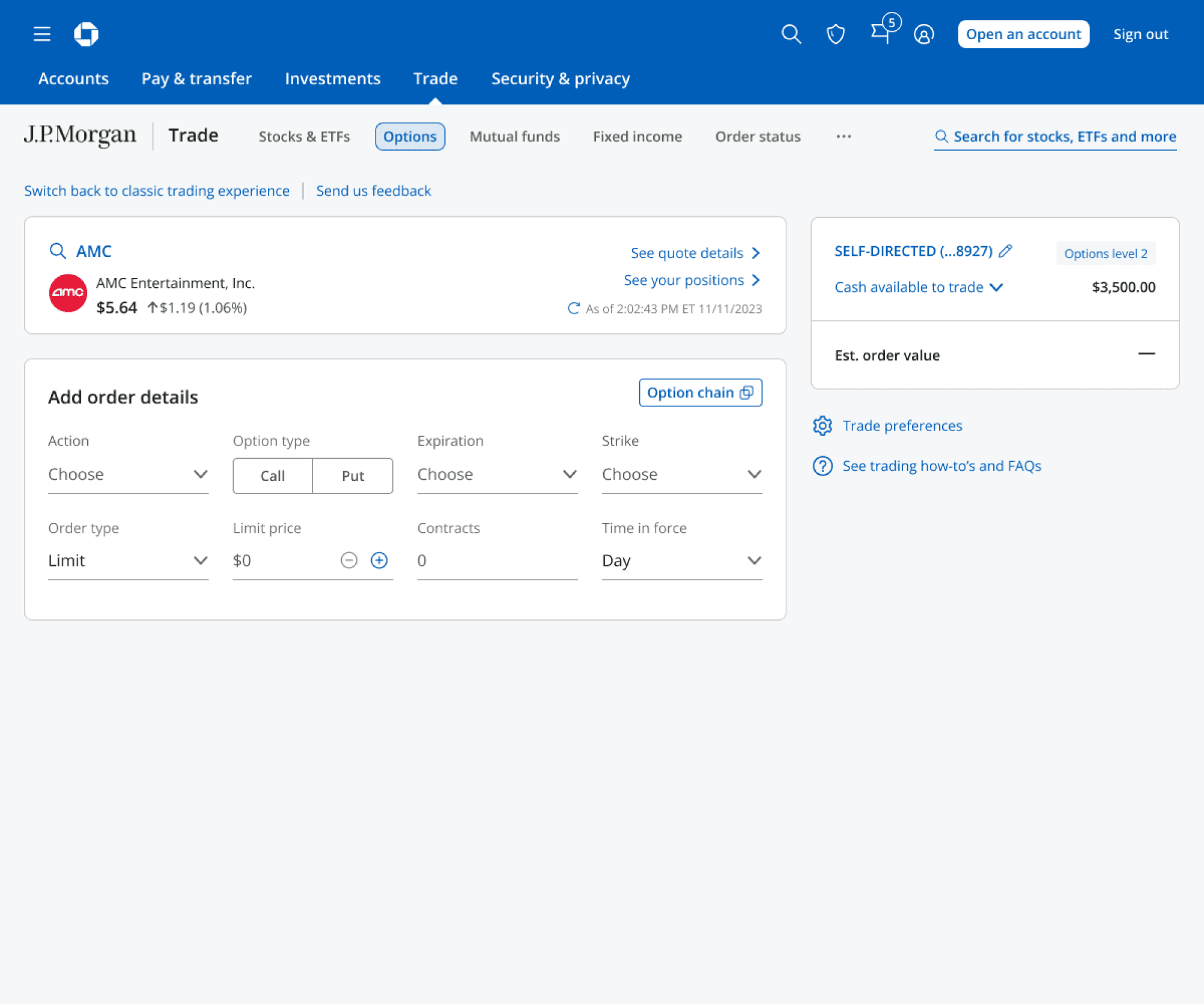
Users Liked Single-page Form + Option Chain
Web participants generally liked the simple approach with the blank ticket but they appreciated the convenience of the in-flow guided chain. While more participants reported a preference to explore various pricing via the chain, there were some criticism towards the guided in-line chain having fewer data points compared to the slide-in chain.

Web A
Guided Chain

Web B
Blank Ticket with Slide-in Chain
Participants who saw the mobile prototypes described a better experience with the blank ticket version because it was more convenient since they did not have to go through different screens and it felt quicker. The guided flow version appeared to be frustrating for some participants.

Mobile A
Guided

Mobile B
Single-page
But this [Web A] seems cumbersome... this doesn’t give you enough comparison of the time, because the time is a big component, that’s the premium you’re paying for an option.
Web Participant 3
[Web B] It’s very simple but I rather look at the different pricing like we saw on the other one [Web A] with the strikes, and be able to change expiration dates and compare pricing before making a decision.
Web Participant 7
[Mobile B] I think this is great, I’m all for minimalist mobile interfaces like this, cuz at this point you know exactly what you’re doing. It shouldn’t get overcomplicated.
Mobile Participant 4
[Mobile A] I don’t like it... this is kind of a roundabout way to get to what I want to do. I don’t need to go through multiple screens here, this seems to take me through so many screens to do just one order ticket.
Mobile Participant 4
The second experience [Mobile B] was more natural than the first, there was an ease of... I think it’s just the layout of the screen. That one [Mobile A] is more time consuming but it’s more aggravating because it’s drawing out the process.
Mobile Participant 6


Design & Research Round 3
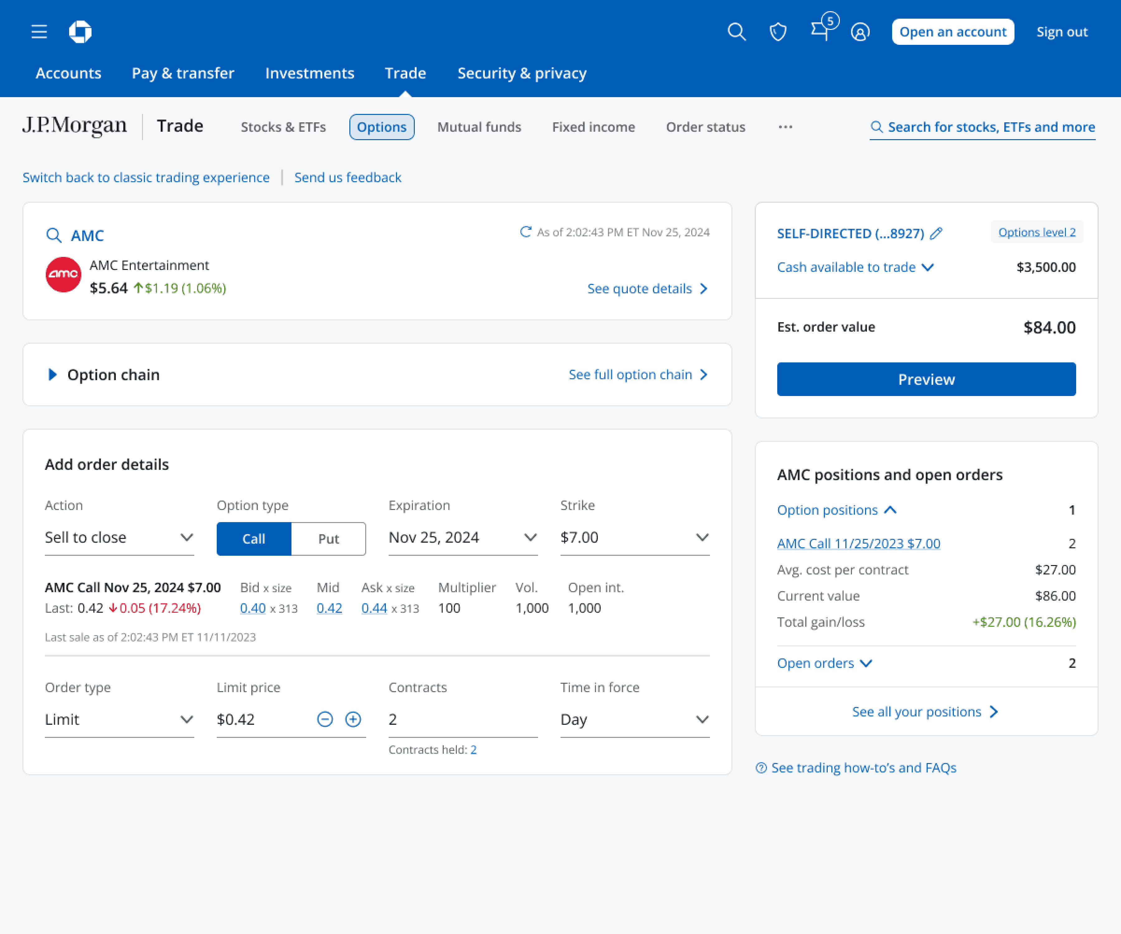
Users Liked In-line Option Chain
Overall the reception to the inline option chain was positive. Most people agreed it was a good balance of information at a glance - “not overwhelming” and “easy to read”.
In comparison, the slide-in chain caused more confusion and uncertainty. Two people reacted negatively to the screen “take over”. One person described it as “I’ve lost my previous screen”.

In-line Chain

Slide-in Chain


MVP Success
Improvement in conversion
over legacy trade experience
67%
Reduction in average clicks
over legacy trade experience
27% (15 - 11)
As of May 2025, the new web option trading experience has been released to all customers.
Accessibility
To ensure above and beyond accessibility, I worked closely with the ADA advisor and the developer team to define the accessibility green lines for the web experience. With our thorough refinement and development, we have one of the best audible trading experiences in the industry.

Post-MVP Improvements
Advanced Strategies, Preferences & More
Since the MVP debut, our team has been working on adding more features including the option chain preferences, higher option levels, multi-leg strategies, and the P/L chart. The advanced features have been planned to release in 2026.


