Calendly
My Role
UX/UI Designer
Duration
1 Week
Overview
This is the design project I did for Calendly as part of a hiring process. The task is to redesign one of Calendly’s landing pages. My design received tremendously positive feedback from the hiring manager and took me to the final round interview. At the end, I couldn’t join Calendly because of my visa status. However, I got paid for doing this fun project and I decided to share it as a proof of my design capability.
Current Website Critique
What’s good:
- Feature descriptions are straightforward.
- Design is minimum.
- Fixed header & CTA.
What can be improved:
- Headline isn’t explanatory.
- It’s unclear what users are signing up for.
- Icons are not interpreting features very well.
- No clear information hierarchy and contrast.
- Inconsistent capitalization.
- Typographical orphan.
- Form is distracting.
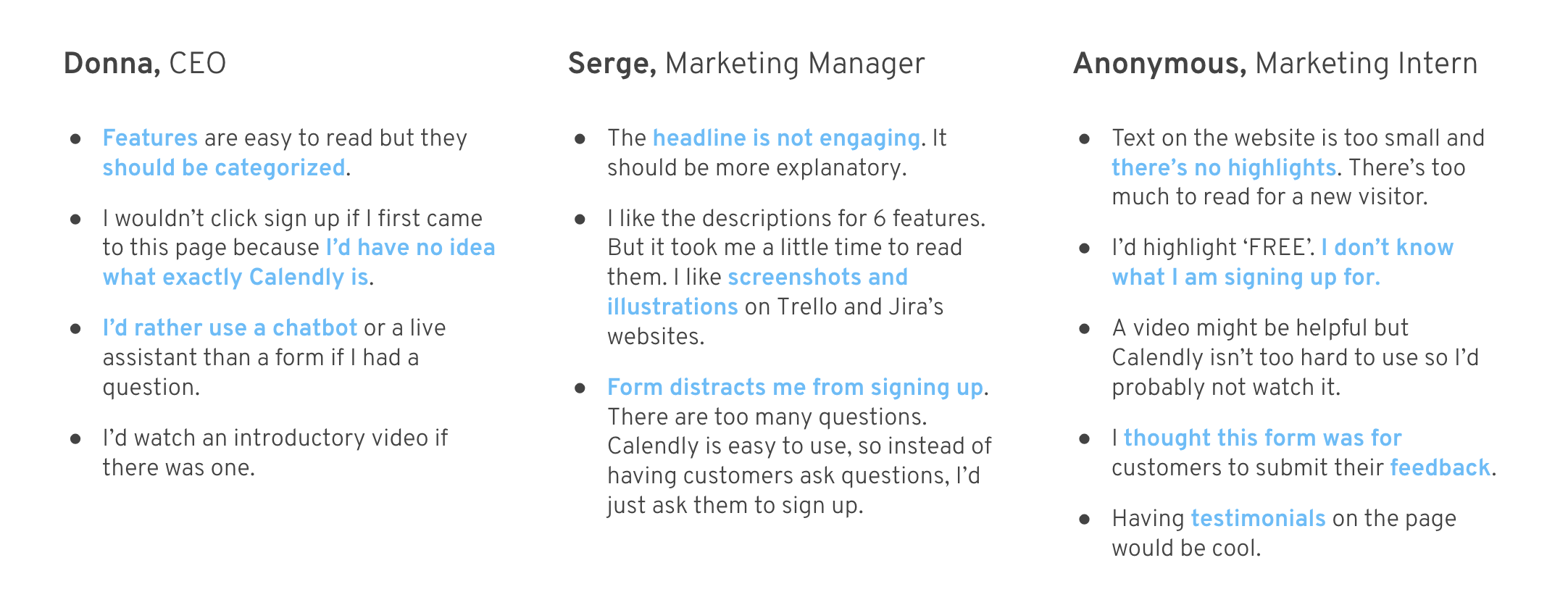
Users’ Voice
I interviewed a startup CEO(sales background), a marketing manager and a marketing intern for their thoughts on the current page and their favorite landing pages. Here are some highlights.
Design Objectives
Based on my critique and interviewees’ feedback, I summarized my design objectives.
-
Content Strategy
- Reorganize features following information hierarchy
- Lower form’s hierarchy on the page
- Construct a narrative flow to better engage users
- Revise authoritative statement and reinforce product’s authenticity by introducing testimonials
-
Visual Design
- Use illustrations + product interface to help explain features
- Adjust text sizes to create visual hierarchy
- Sectionize the content by using color contrast and different layouts
- Be creative but be careful not to make the design completely foreign
-
Responsive Design
- Make sure the design is mobile friendly
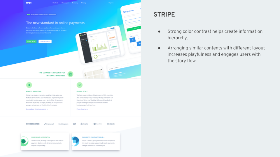
Landing Page Best Practices
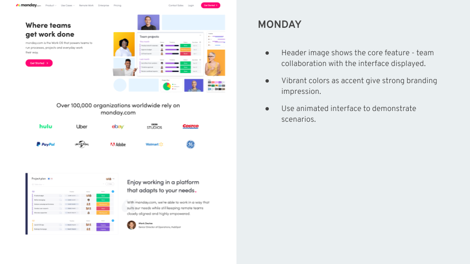
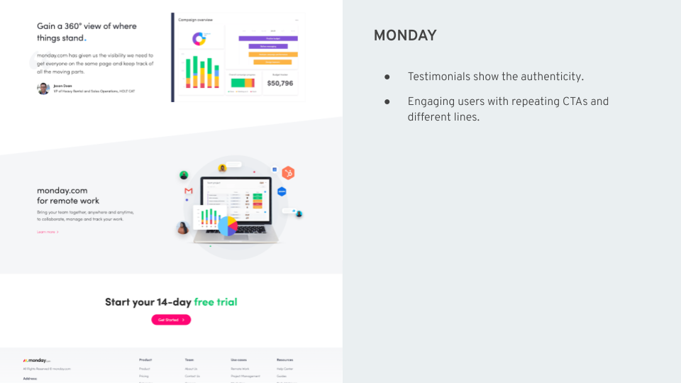
Next up, I looked at some well-designed SaaS landing pages to get inspiration. I used Monday, Stripe and Trello as examples.


Wireframing
After analyzing the competitors, I drafted the first wireframe. Here are the highlights.
- Added a bigger header area and large headline.
- Converted 6 icons into illustrations and reorder them.
- Added another CTA area on the bottom with a different headline(trying to create a narrative flow).
- Added testimonial section on the bottom.

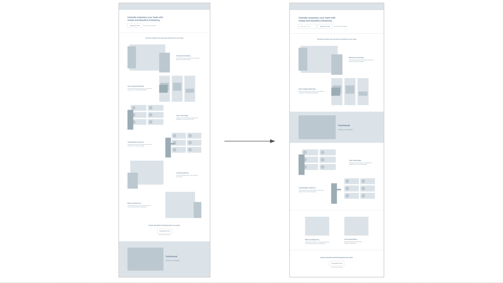
However, this page looks too long and doesn’t have a clear information hierarchy. I decided to analyze the current page contents and reorganize them. There are 6 highlights of the product and I realized they could be grouped as followed:

Then, I iterated the wireframe to synthesize the new groups. Now the page looks more compact and has better hierarchy.
Visual Design Exploration
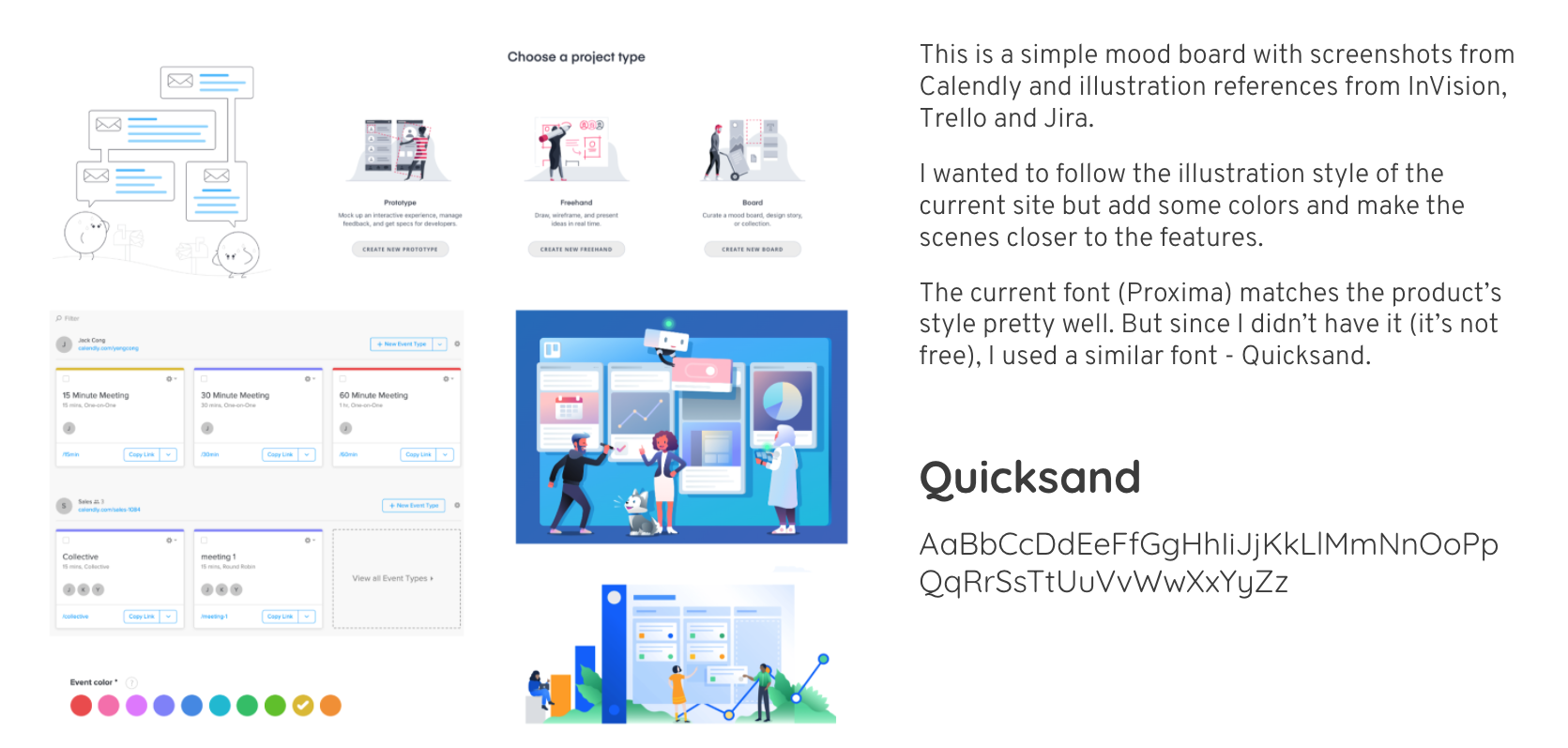
Now it comes to the aesthetics part. I wanted to use illustrations to express a fun feeling which also incorporates Calendly’s branding. I found some well-designed SAAS landing pages as references and put them on a moodboard.
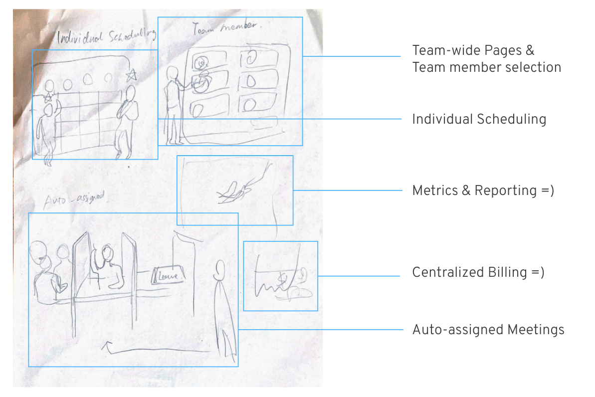
Then I started sketching illustrations on a piece of paper.
Creating Illustrations
I created these illustrations using Affinity Designer. I put the actual interfaces and cartoon characters together so the user scenarios are obvious.
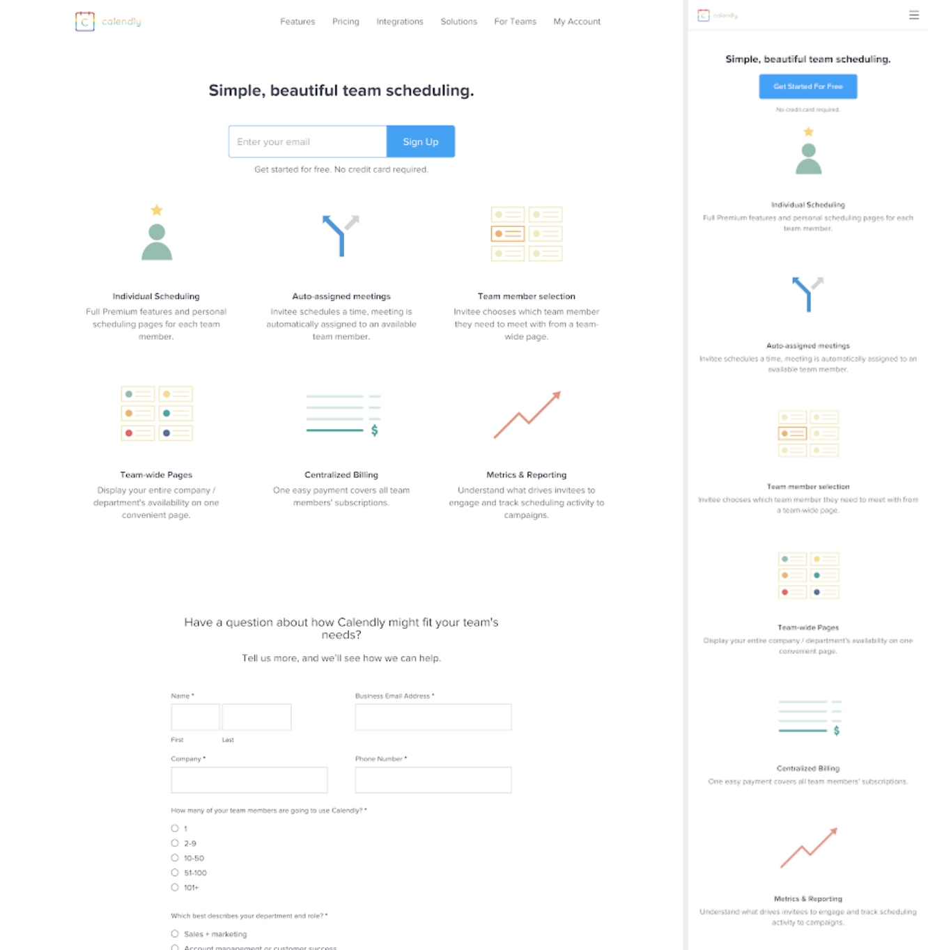
High Fidelity Mockups
With the wireframe and illustrations ready, I created the hi-fi mockups.
And of course I made the mobile version.

Next Steps
I received very good feedback from the stakeholder. However, here are a still few things I think we can do to make the page stronger in the future.
- Keep working on copywriting
- Animate the illustrations to make them more engaging and explanatory
- Apply new branding elements to the page